Create a coherent vintage wedding palette by choosing one main neutral, one supporting color, and one restrained accent. Then test those colors in your venue with the materials you will actually use. “Timeless” is an aesthetic judgment, not a guarantee; a limited palette often looks settled because its parts have clear roles.
You can suggest a vintage mood through texture, proportion, and finish without making every object look antique. Matte paper, natural linen, softly varied flowers, and warm metal details can create continuity across stationery, clothing, and tables. Start with the room rather than a color trend.
Let the venue supply the first color
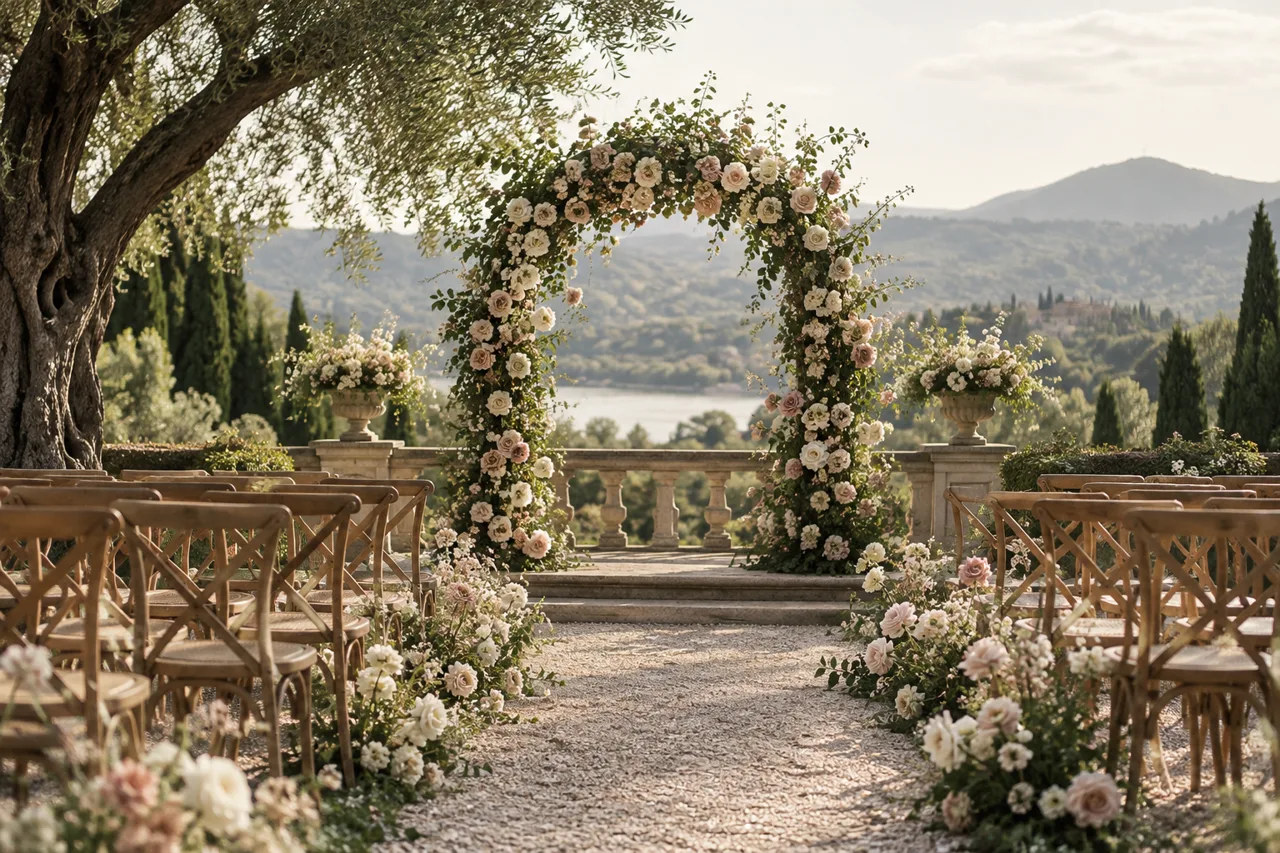
Look at the fixed elements: walls, flooring, curtains, garden planting, and existing chairs. These colors will appear in photographs even if you do not include them in your inspiration board. A palette that acknowledges the setting usually requires fewer decorations to feel complete.
If the room has strong red upholstery, a delicate pink and blue scheme may need careful testing. If the venue has warm stone and dark wood, ivory and soft green can connect naturally. You can still choose a surprising accent, but give it a deliberate place instead of scattering it everywhere.
Build a small physical sample board. Include a linen swatch, paper sample, ribbon, and a photograph of the venue in similar light. A digital board is useful for gathering ideas; physical materials reveal differences in undertone, sheen, and texture that screens tend to flatten.
Ivory, dusty rose, and antique brass
This combination suits a romantic interpretation of vintage style. Use ivory for the largest surfaces, dusty rose in flowers or selected textiles, and brass in small repeating details. The metal should connect the setting rather than cover it. A few candlesticks can be more effective than several unrelated metallic accessories.
Keep the rose tones varied within a narrow family. A bouquet with muted pink, cream, and a little deeper rose can feel more natural than one in a single exact shade. Check floral availability with your florist and agree on acceptable substitutions rather than requiring a specific bloom at any cost.
Sage, warm white, and natural wood
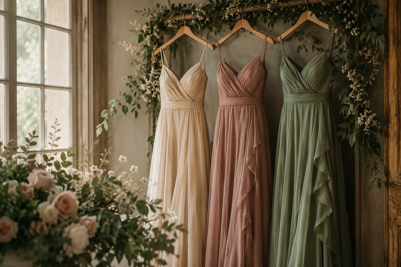
Sage works particularly well when the setting already contains foliage. Warm white prevents the palette from feeling too dark, while wood gives it a relaxed grounding. Use a darker green for printed text if pale sage does not provide enough contrast on paper or signage.
This combination can lean formal or informal depending on materials. Crisp linens and clear glass feel different from loose cotton runners and textured pottery. Choose one direction for the most visible elements, then allow small variations. Consistency in scale often matters more than exact color matching.
Soft blue, cream, and pewter
Muted blue can create a cooler, quieter atmosphere. Cream warms it, and pewter adds a gentle contrast without a bright metallic flash. Test blue under the room's evening lighting; a gray-blue sample may appear quite different after sunset.
For clothing, consider a range of related blues rather than assigning everyone an identical shade and fabric. Confirm the intended degree of variation before purchases. A sample group photograph or side-by-side swatches can reveal whether the combination feels harmonious or accidentally mismatched.
Burgundy, blush, and candlelit ivory
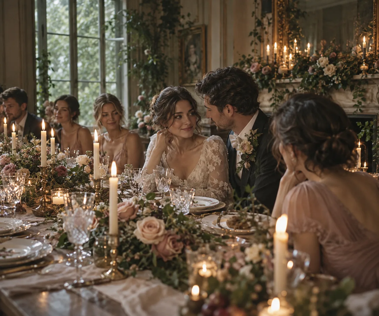
A deeper accent can give a vintage palette definition. Burgundy is most useful in controlled areas such as a ribbon, a few flowers, or selected printed details. Let blush bridge the deep color and the ivory background. Too many dark surfaces can change the atmosphere from romantic to heavy.
If you want candles, confirm what the venue permits before designing around open flames. Approved enclosed candles or suitable battery alternatives may be necessary. Plan the table so the decoration leaves space for plates, water, serving, and conversation; atmosphere should not compete with dinner.
Champagne, olive, and warm stone
This palette can suit a courtyard or venue with natural masonry. Champagne fabric adds softness, olive brings depth, and the setting supplies the stone color. Ask to see fabrics in daylight: “champagne” can describe several different undertones, from pale beige to warm gold.
Use texture to distinguish similar neutrals. A matte linen napkin against a smooth plate and translucent glass can create depth even when their colors are close. You do not need a bright accent if the materials already provide enough visual interest.
Translate the palette into decisions
Assign each color a job. Your neutral might appear in linens and stationery; your supporting color might appear in flowers and wedding party clothing; the accent might appear in ribbons and small table details. This is a planning aid, not a fixed ratio that every item must obey.
Create a short supplier brief naming the colors, preferred finishes, and elements you want to avoid. Include the venue photograph and a few approved samples. Ask suppliers how their materials vary naturally. Flowers, fabric dye lots, and wood finishes will not always match a screen reference exactly.
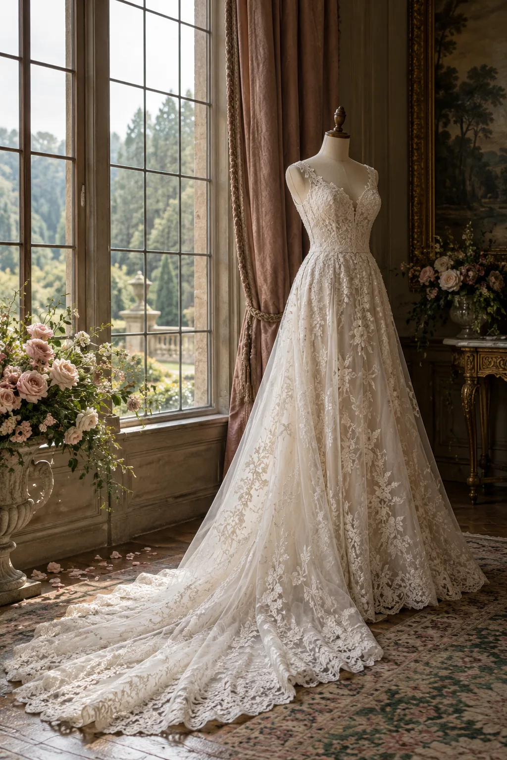
Connect the clothing to the room without making it disappear into the decor. Our Victorian-inspired wedding dress guide explains how lace and silhouette can establish the mood even when the gown is a simple shade of ivory.
A practical palette review
- Does the combination work with the venue's fixed colors?
- Are printed words readable on the chosen background?
- Have you checked samples in daylight and evening light?
- Does every color have a clear role?
- Can suppliers suggest acceptable material substitutions?
- Will the tables still function with the planned decoration?
If your celebration is outdoors, pair this process with our garden wedding planning guide. The strongest palette is one that belongs to its place. Use a small set of colors consistently, let texture provide richness, and leave enough visual quiet for people and flowers to be the focus.
Palette comparison at a glance
The comparison below summarizes suggested design roles, not historical rules. Use it as a supplier conversation starter and test the actual materials before committing.
| Palette | Main surface | Restrained accent |
|---|---|---|
| Ivory & dusty rose | Ivory linen | Antique brass |
| Sage & warm white | Warm white | Natural wood |
| Soft blue & cream | Cream | Pewter |
| Burgundy & blush | Ivory | Burgundy ribbon |
| Champagne & olive | Warm stone setting | Olive details |